Polaroid is a CSS component library for developing UIs in more faster and efficient manner.
Installation
Import the below link in your head section of html file or in CSS file.
Components
Components are the reusable building blocks of our web application. Each component meets a specific interaction or UI need, and has been specifically created to work together to create intuitive user experiences.
References
- Icons from font-awesome
- Images from google images and picsum
Alert
Alerts are use for showing small messages to user.
Use different alerts depending upon the use cases such as, to
show success, information,
error and warning.
This is a success alert - use it in your projects
This is a info alert - use it in your projects
This is a error alert - use it in your projects
This is a warning alert - use it in your projects
Avatar
Change the size of avatar by simply changing the class according to your usecase.
Sizes are extra-small avatar-xs, small
avatar-sm, large avatar-lg and
extra-large avatar-xl.
Image avatars, put your image in src and provide an
alt.
Letter avatars, put your initials of your name.
RM
SR
JJ
AB
Badge
Badge is use for notifications and for user status and for many other usecases such as on cards.
Colors of badges can be change by changing class name i.e blue
blue-badge, red red-badge and green
green-badge.
Badges with numbers on them.
4
4
4
10
9+
Badges without numbers.
Badges on avatars, for badge to be at bottom right just add
bottom-badge in class.
Card
Cards are use for showing products on ecommerce or for users
posts on social media. For card to have a shadow put
card-shadow in the class.
New
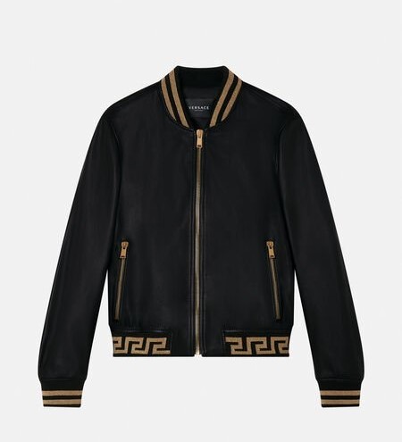
Men premium jacket
₹2000
Men premium jacket
₹2000
Men premium jacket
₹2000
Card with text overlay and text only cards.
Men premium jacket
₹2000
Jacket
An outer garment extending either to the waist or the hips, typically having sleeves and a fastening down the front.
Horizontal cards.
Men premium jacket
₹2000
₹3000
50% off
Grid
Grids are used for layouting the elements in row and column manner.
For different variation of grid put class
grid-col-2 for 2 columns,
grid-col-3 for 3 columns, and for responsive grid
with minimum width of 100px of each column give
grid-responsive-min-100.
Note: grid-item property will give some
default style with border and background, remove that class if
not needed.
1
2
3
4
Grid with 3 columns.
1
2
3
4
Responsive grid will adjust the columns by itself.
1
2
3
4
Image
Responsive images can be use for profile picture and as a background.
For round images put rounded-full and for images
with rounded border put rounded-sm in
class. And also provide a alt.
Input
Input and textarea fields for taking input from user.
For representing success message put
success-msg and for error put
error-msg in class.
Please enter correct email!
👋 Login successful.
Lists
List for use for listing elements example contact list.
Spaced list or normal list
- First item
- Second item
- Third item
Stacked list.
-
Person name
first.last@example.com
-
Person name
first.last@example.com
-
Person name
first.last@example.com
Modal
Modal is use for getting confirmation or showing some information to user.
Demo for the modal. For opening a modal with custom button, give
that button modal-open-btn class and to close modal
give modal-cancel-btn class.
JavaScript for modal.
Rating
Rating component provide insight regarding other's opinions and experiences of a particular
product. Put rated class to fill the rating item.
Slider
Slider are use for having different ranges example price range.
For this slider the range is minimum 1000 and maximum is 10000, which you can change according to usecase.
Javascript for slider.
Toast
Toast are use for small notifications.
For different types of toast put class success or
warning or info or error.
And for different position put top-left or
top-right or bottom-left or
bottom-right or bottom-center.
This is a success toast!
This is a warning toast!
This is a info toast!
This is a error or danger toast!
Demo for the information toast.
JavaScript for toast.
Typography
Text utilities for your projects.
H1. This is heading
H2. This is heading
H3. This is heading
H4. This is heading
H5. This is heading
h6. This is heading
For different font-weights use different classes
font-black or font-bold or
font-semibold or font-regular or
font-light.
This is dummy text
This is dummy text
This is dummy text
This is dummy text
This is dummy text
For different font-sizes use class text-xl or
text-lg or text-base or
text-sm.
This is dummy text
This is dummy text
This is dummy text
For gray text use gray or
dark-gray class and for alignment of text use
text-left or text-center or
text-right.
This is dummy text
This is dummy text
This is dummy text